November 11, 2019 | photography
This blog post consists of two parts: In the first, I explain a phenomenon about a feature that is important to understand when shooting raw with a mirrorless (or a DSLR when used in live view) camera. In the second, I point out what I find to be huge problems with Fuji’s implementation of said feature – in several ways.
Part 1: Why Blinkies are Wrong
In my previous post, I talked about highlight warnings, also known as “blinkies”. What I didn’t talk about there was that blinkies are wrong, most of the time.
Here’s why: When you review pictures in-camera, it shows you a jpg generated from the raw file. This jpg has less dynamic range than the underlying raw data, et voilá!
Therefore, part of getting to know your camera is getting a feeling for how much leeway there generally is, so that when you’re out shooting, you know when you’ll actually have lost detail in your file. Of course, this becomes especially relevant when using the technique of “ETTR”, exposing to the right.
Part 2: Fuji and Blinkies
The jpg Problem
Now, what’s special about this with Fuji? As I said, blinkies and histogram are derived from a jpg. Well, Fuji is big in the game of fabulous (from what I hear) jpg files sooc – straight out of camera. And that’s great, except for in one aspect:
A jpg that is intended to be a final photo is a fundamentally different thing than a raw file with the highest possible dynamic range, or even a jpg file approximating the same. A final picture may have… contrast. Or intense colors. Therefore, it’s not at all suitable to be the base for a feature that is intended to show the limits of a file’s dynamic range. The two goals of showing a final picture and a file’s dynamic range are at odds with each other. That’s why Fuji’s focus on jpg works out to be a disadvantage for the raw shooter in this instance.
So, what’s the solution? Well, there is none. But there’s a hack: A jpg look that is as “flat”, as little “opinionated” as possible. Eterna is a Fuji film profile intended for video use very flat and can be configured to be even flatter, so it’s very well suited for the inclined raw shooter’s needs in this instance. With this, the images you review in-camera are the best representation of a raw file Fuji’s current system/philosophy allows for.
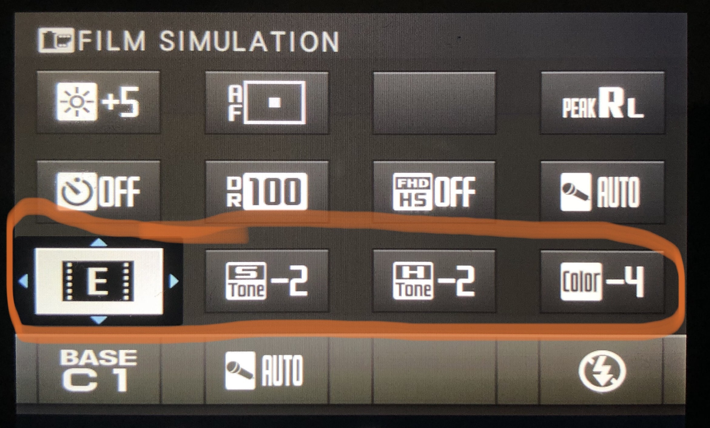
Recommended "film simulation" setup for raw shooters
Check out this dpreview forum thread for some more Fuji-specific talk on this.
The EVF Problem vs. “Natural Live View”
But there’s one more thing: Before, I was a bit imprecise and only talked about reviewing pictures on the back of the camera, completely omitting that you gotta be looking at something while shooting as well! The EVF/back screen are showing video feeds. To a close approximation they’re showing something like jpgs as well, just so many per second it becomes a video. So the same rules apply.
Talking about Fuji specifically though, there’s good news in this regard: There’s a feature called “Natural Live View”. It takes the “film look” configuration out of the equation and actually gives you an even flatter look/profile/whatever-you-wanna-call-it for operating the camera. It still shows the effects of exposure correction (and everything else would be really dumb), so it’s a really great feature.
With this enabled and the above mentioned Eterna-configuration, you’re good to go.
The Contradiction between EVF and Playback-jpg
Sadly the praise ends here, because there’s already a big problem. There’s inconsistency between how a scene is represented blinkies-wise live in the EVF, and in a Playback-jpg.
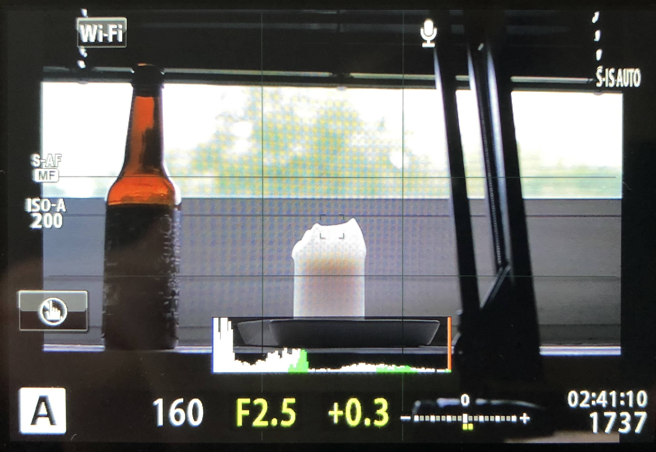
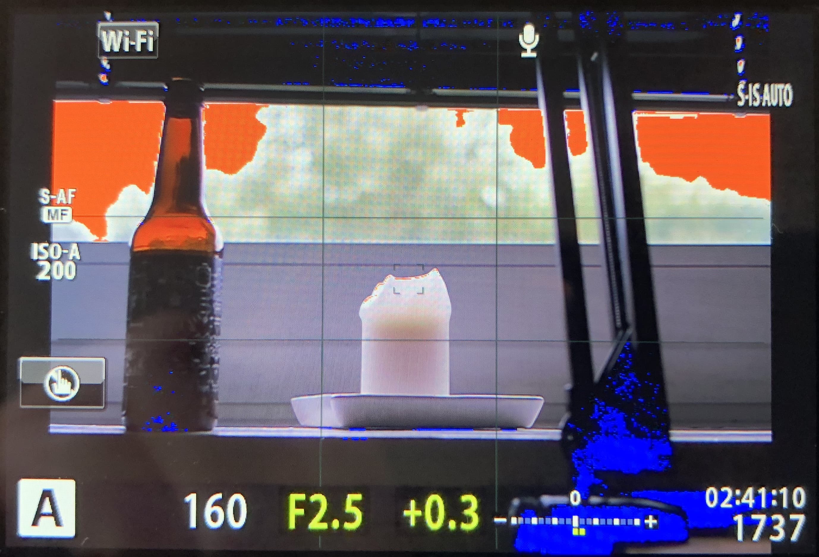
Which means the camera contradicts itself. Also: You can’t be completely sure that the light just changed between you pressing the shutter release button and the camera taking the exposure. For all you know, the moment you saw in the “Natural Live View”-EVF/back screen has gone by, and the blinked-to-death (I’m exaggerating) playback-jpg is all you’re left with. Example:
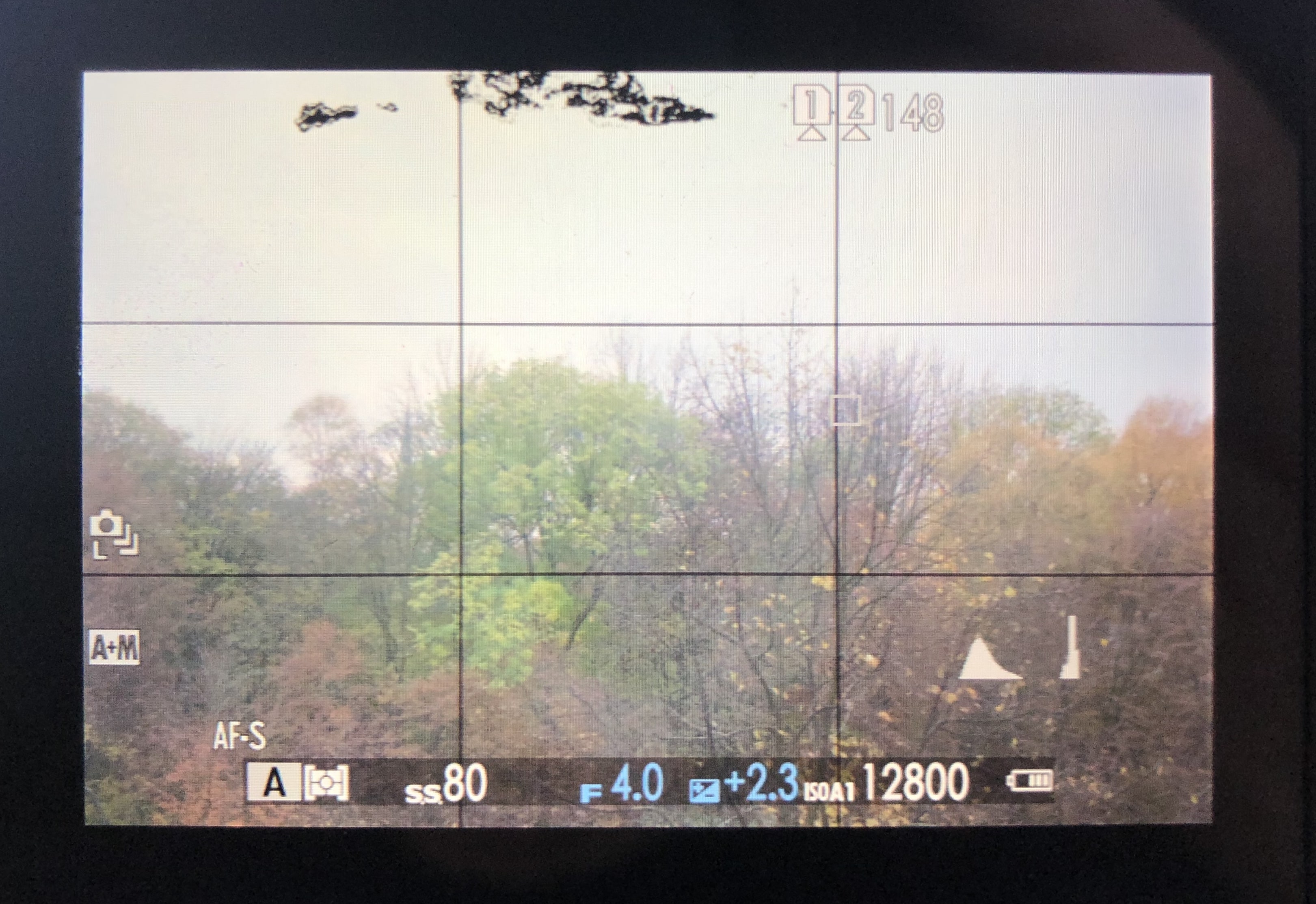
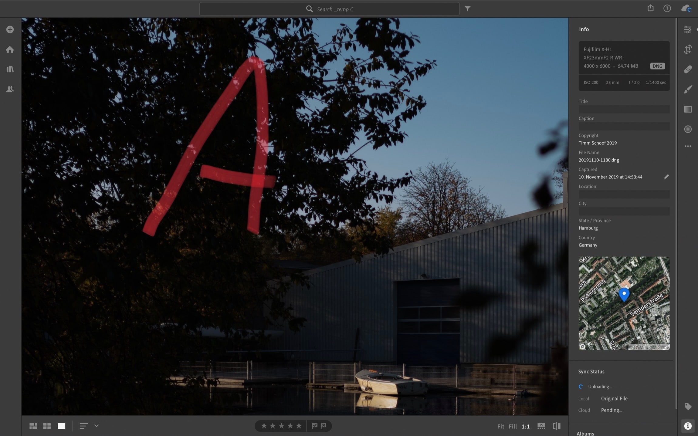
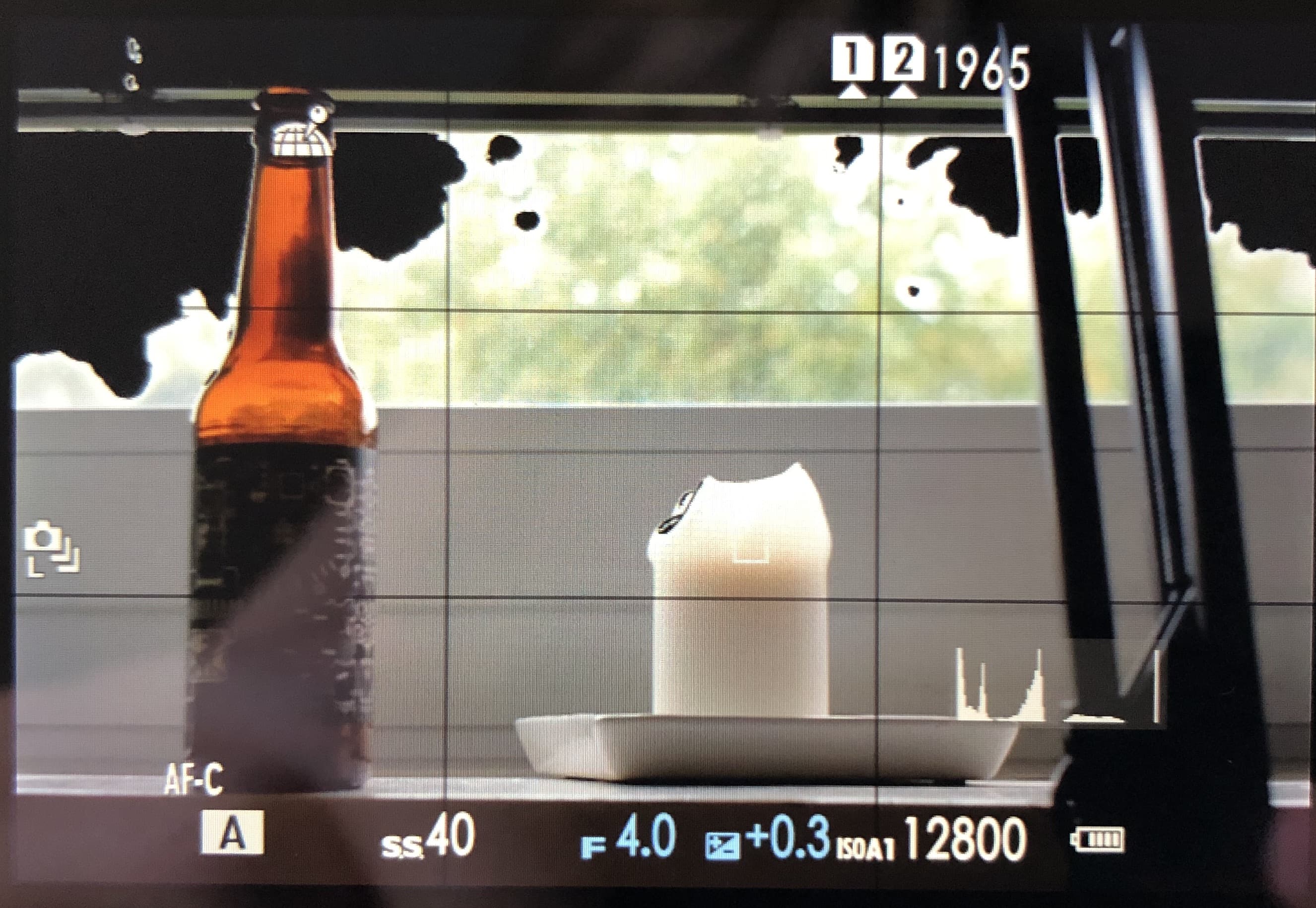
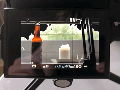
Scene viewed through the back screen
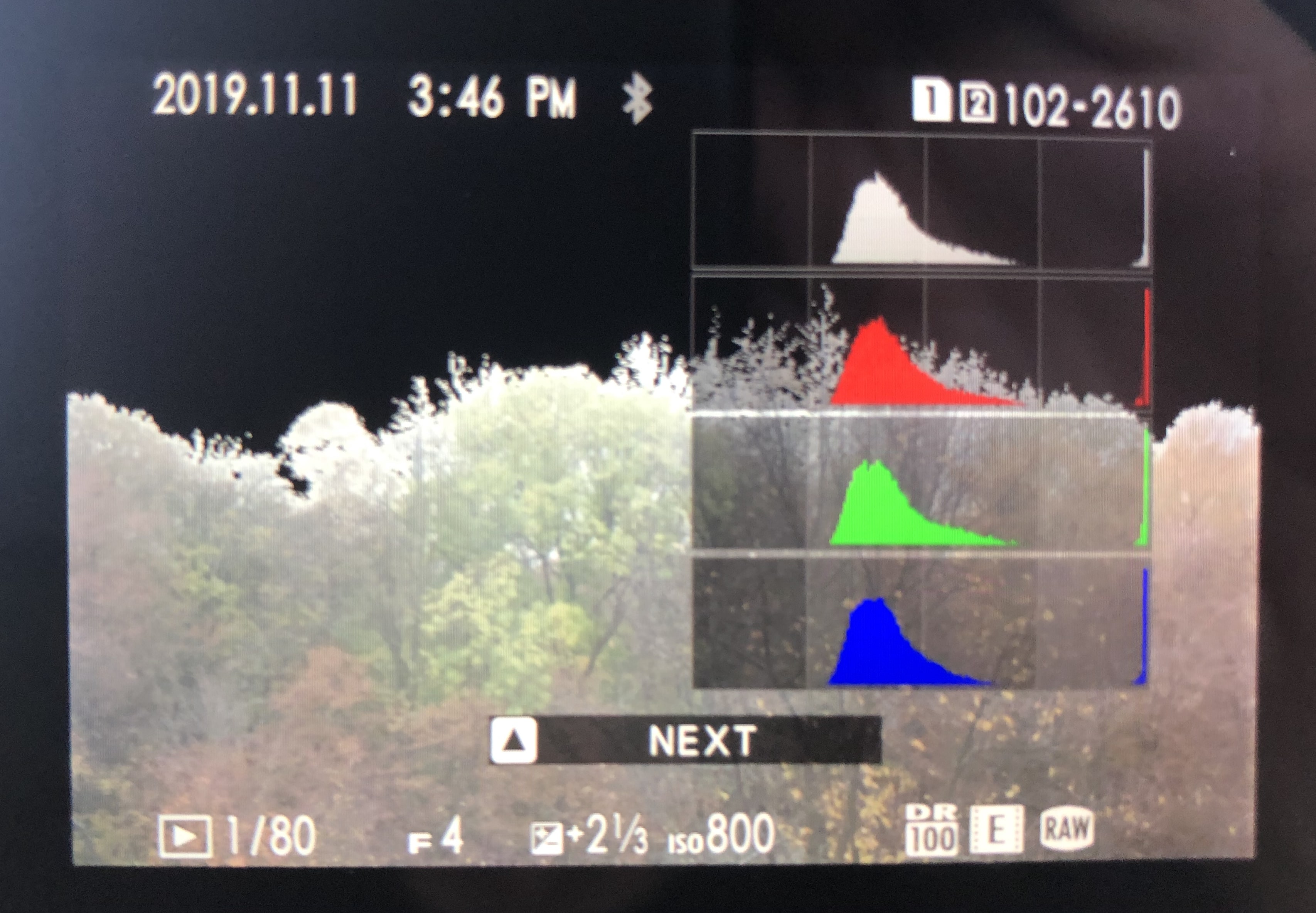
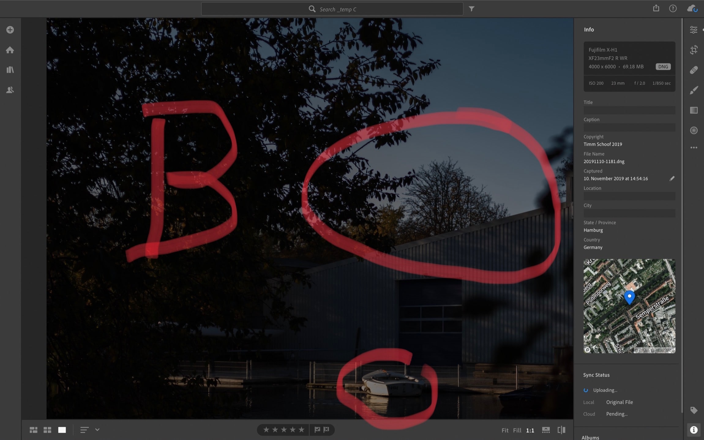
Same, "exposed" scene as playback-jpg
So, which one is “more right”? I’m sure this varies from scene to scene, but here’s this example scene in Lightroom.
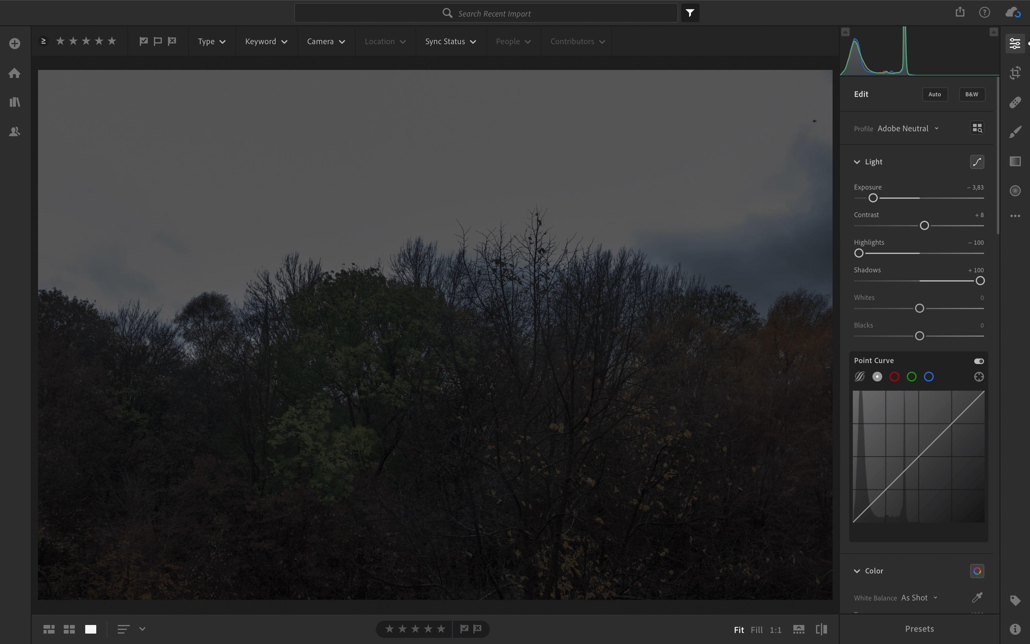
Tons of lost detail showing in Lightroom
As you can see, It’s bad. The playback-jpg was “more right”. There’s only a little less detail lost than the playback-jpg indicated, and way more than the view in the EVF/back screen led us to believe. As a general rule, the raw file in the end will retain more detail than the playback-jpg and not less, but that’s obvious.
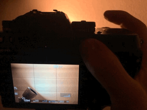
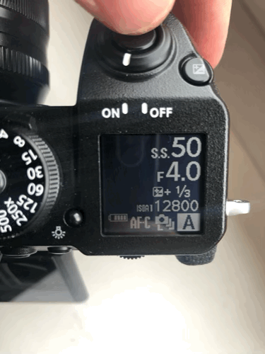
In case you’re tripped up by “ISOA1 12800” showing in the upper grab from the back screen, that’s something I already talked about.
It’s even worse
There’s even more – I’m sorry. Between EVF and playback-jpg, there’s a third… “opinion”. With Fuji cameras, they stop down and do some amount of actual metering towards taking the picture upon half-press of the shutter relasse button, as I have already complained about, also in my previous post. At that point, the metering – or at least the blinkies display – goes crazy. Or becomes more accurate? Who knows? It’s all up in the air.
In some situations, the blinkies increase in area on half-press of the shutter
To make matters even worse: In between the blackouts that are caused by the shutter when taking a photo, the camera shows the scene, and takes another run on guessing how much of the scene is overexposed. Shown in frame 3.
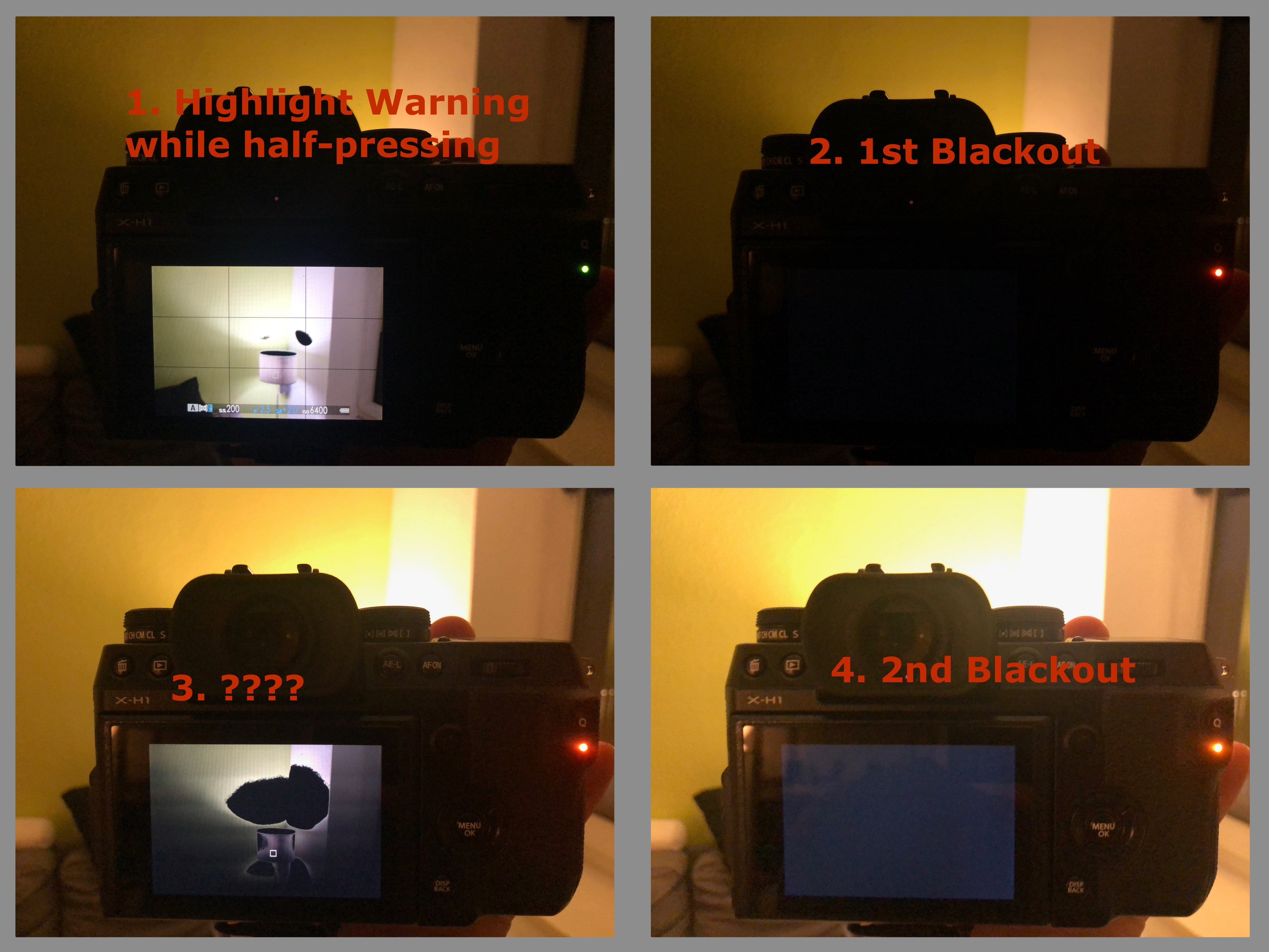
Just another instance of inconsistent metering
I don’t blame you if you lost count. We’re up to four differing interpretations metering/blinkies-wise of a given scene (chronological order):
- EVF/back screen
- EVF/back screen upon half-press
- In between blackouts
- jpg in playback
… what the heck?
Another Example
For illustration purposes, here’s two more real-world examples.
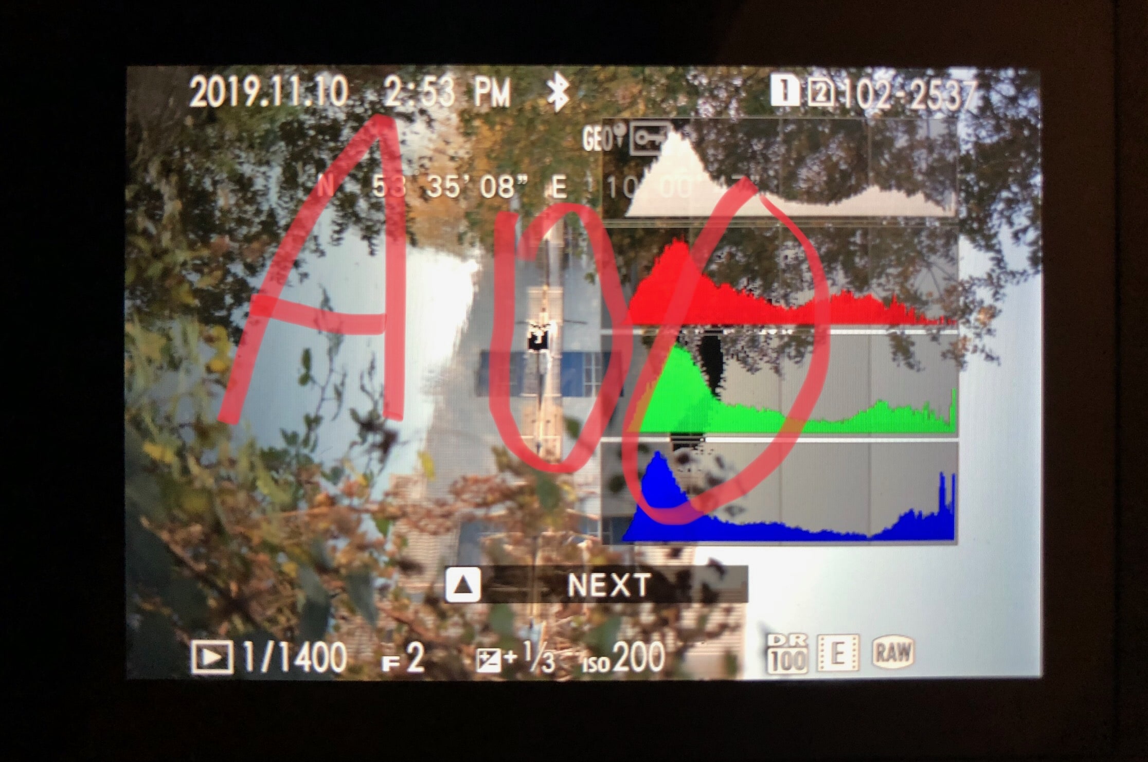
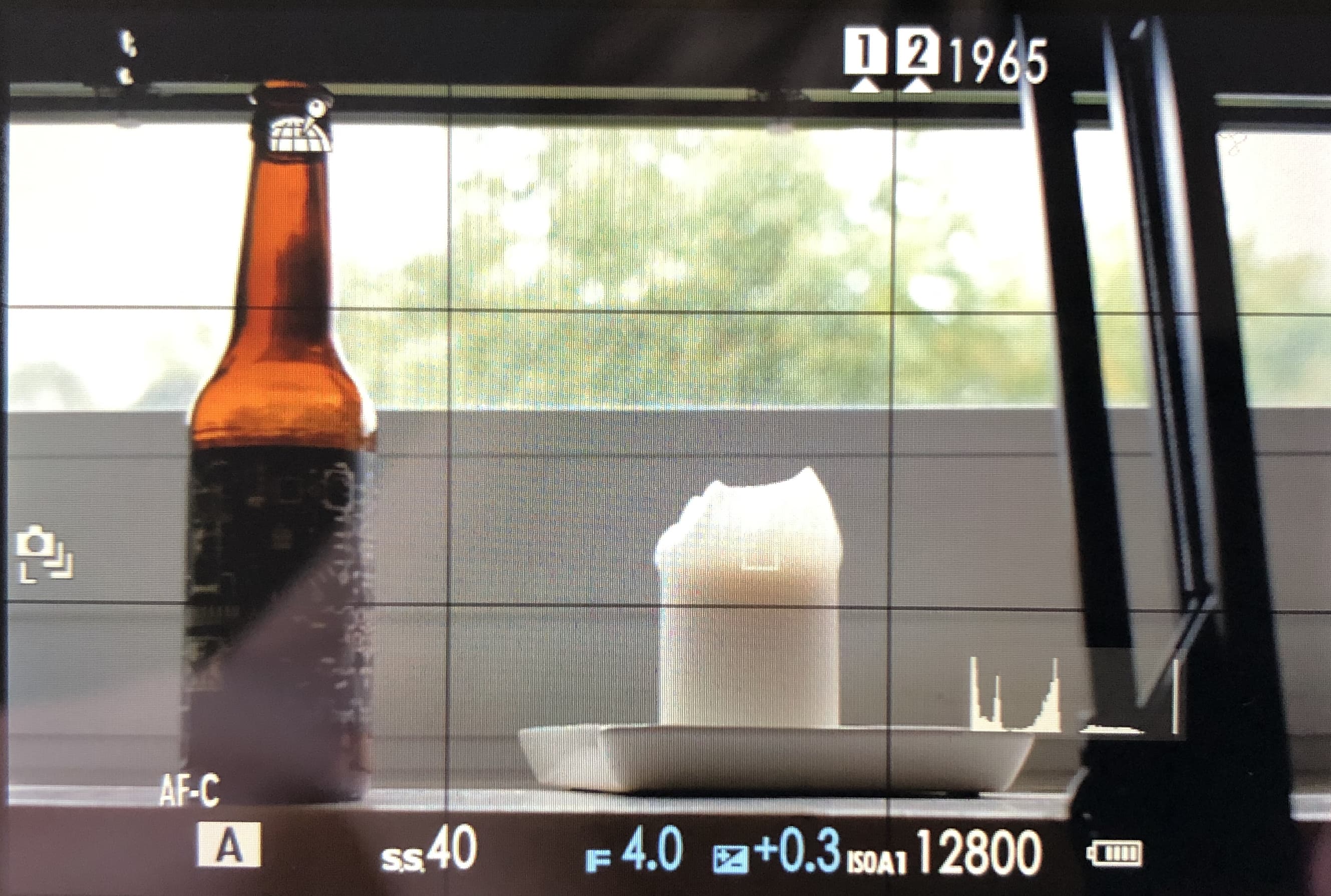
Shot A as a playback-jpg from the back of the camera. Note the (circled) black blinkies indicating the amount of lost detail.
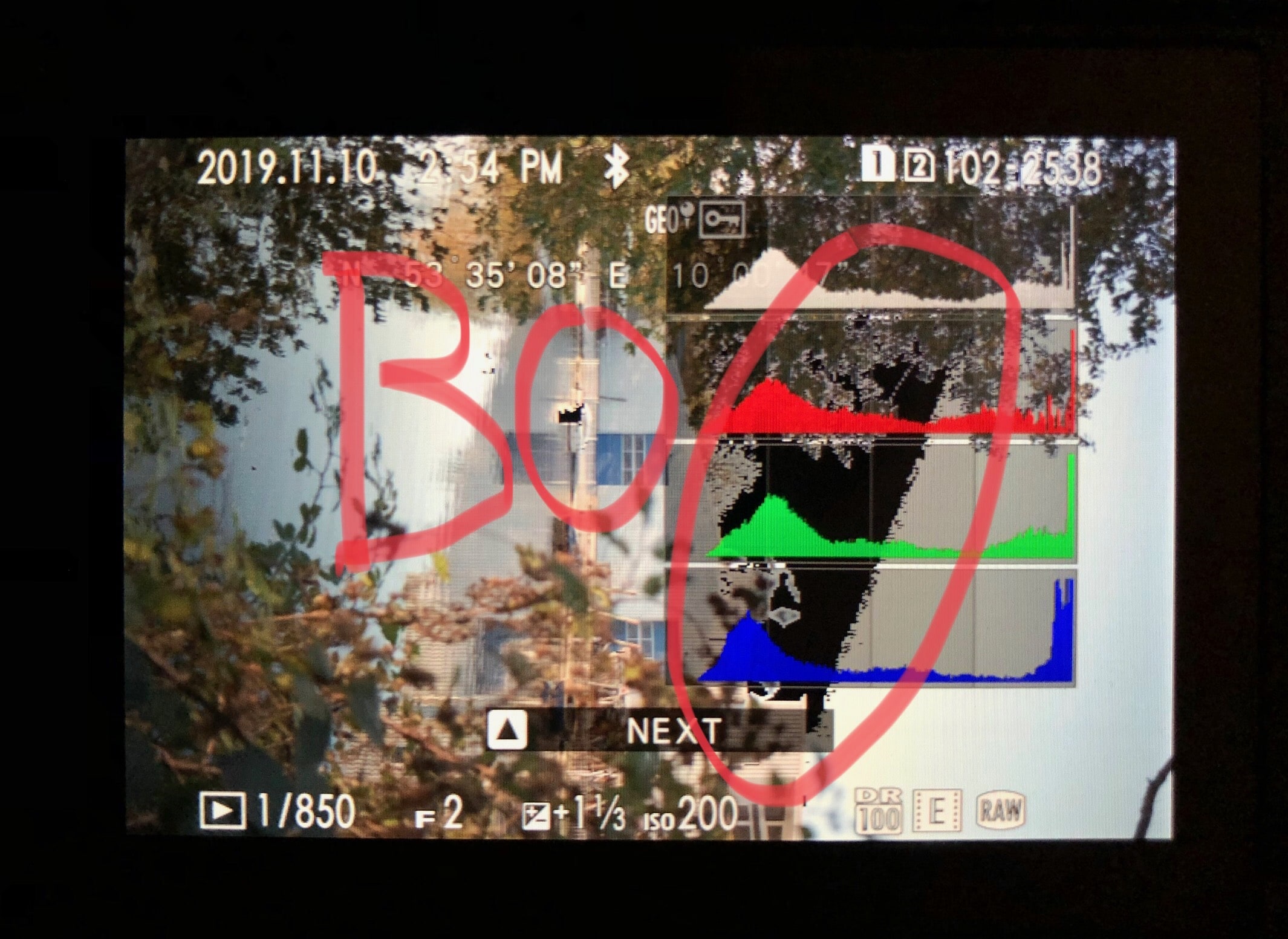
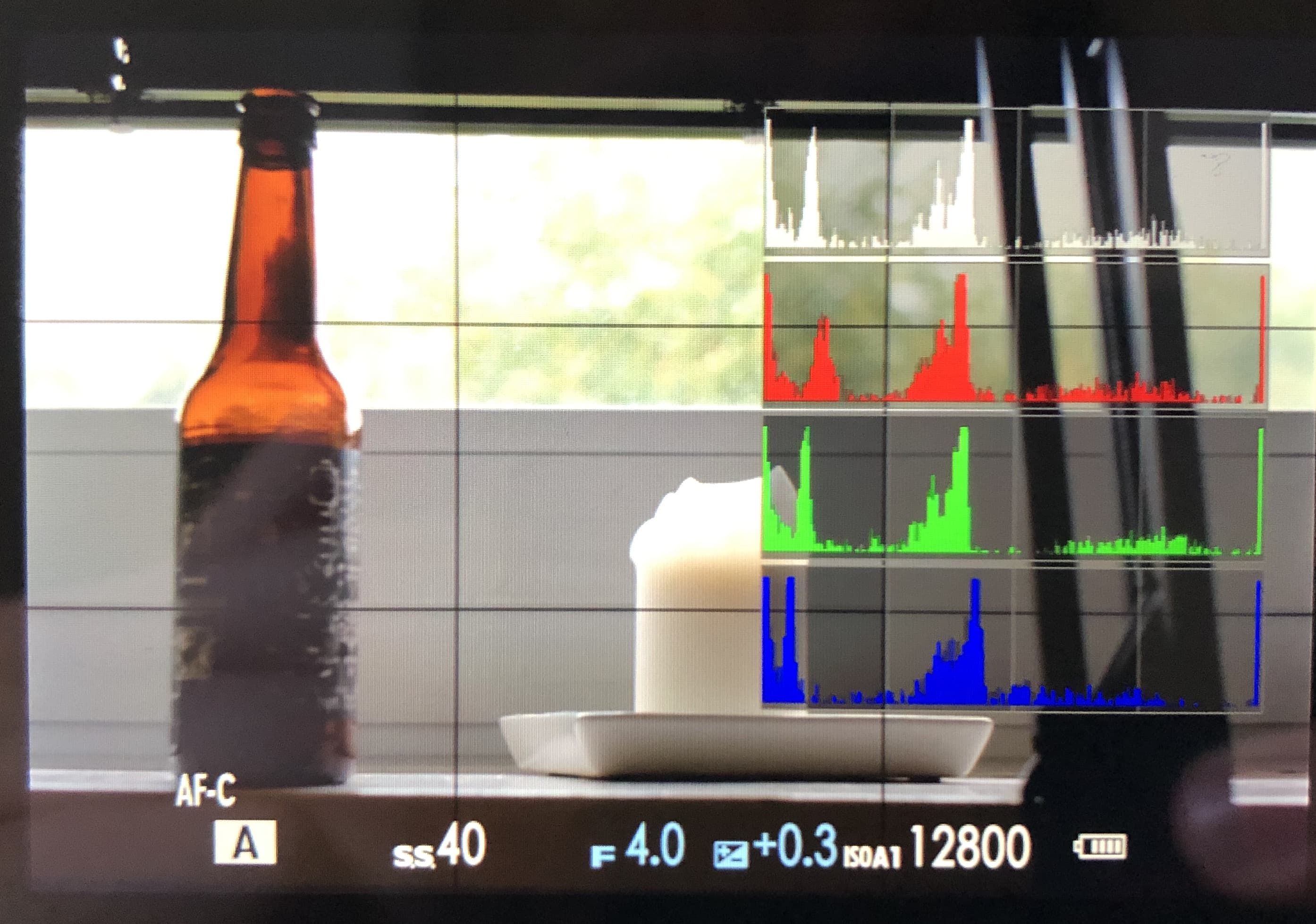
Shot B as a playback-jpg from the back of the camera. Note the (circled) black blinkies indicating the amount of lost detail.
Shot A I had corrected down so that upon half-press I didn’t get significant blinkies. Then I decided to be stubborn, trust the metering just looking through the EVF and take shot B. Just to have an idea of the scale, as the EV+/- indicator… indicates, these two exposures are 1 stop apart.
(by how much) Was my trust betrayed? Let’s find out in Lightroom!
Shot A in Lightroom
Shot B in Lightroom
It’s not easy to see only looking at shot B, but in direct comparison with shot A, there’s some lost detail, especially on the side of the boat. Zoomed in, the tree’s small branches also look very fuzzy, and there’s blue sky in the whole area behind the tree, no solid white like it shows in shot B. My trust was betrayed by ~ 1 stop, as the playback-jpgs did indicate.
So, based upon this example, I’d mentally “throw away” the blinkies displayed during just looking through the EVF, and only pay attention to the ones displayed after half-press, and with them overshoot +1/3 to +2/3 EV I guess?
That’s workable, but I still don’t appreciate the inconsistency. If the camera can only display accurate-ish measurements after half-press, then don’t bother with blinkies before!
You could do the same just based upon the playback-jpg, if you miss the feeling of using an old-school DSLR. I, for one, didn’t go mirrorless for having to go back to playback in order to know how my pictures turned out – like an animal.
Conclusion
Of course, this doesn’t prevent anyone from taking any conceivable picture, and I’m not arguing that. You have to be pretty oblivious to not think twice about losing detail in a high-contrast scene. Also, this phenomenon becomes more extreme with more exposure compensation as well as contrast in the scene (that’s my recollection, I didn’t do explicit test on it, though).
That being said, I don’t get why in this somewhat mature age of digital photography, an accurate overexposure warning is not on Fuji’s (or any manufacturer’s) radar. The “Natural Live View” feature seems to indicate that it is to some extent, but the utter oversight in every other aspect contradicts this.
What really, really bugs me is the increase of blinkies upon half-press, because it makes the camera feel unreliable to me. And this is not limited to me taking a picture of a lamp in the dark with exposure compensation +4, but happens in absolutely normal everyday situations with elevated contrast, as the shot A/shot B example shows.
My old Olympus E-M10, while being a little inconsistent between EVF and preview as well in a quick test, doesn’t show this (weird) behaviour at all.
I could accept this if there was a) less variation and b) one of ‘em was consistently more accurate. a) is a minus, and during my test done for this post, I found no indication of b) either.
Thank you for reading/skimming this far. Have you encountered the same problem? How do you deal with it? Most importantly: Was I unclear with anything? Any feedback is very welcome :) Especially about whatever happens or is the reasoning behind the behaviour upon half-press with Fuji cameras. Thank you!
September 26, 2019 | photography
I just switched from an Olympus E-M10, an entry-level micro four thirds camera from 2014 to a Fuji X-H1, a more or less top of the line APS-C model released in early 2018. If you’re interested in what went into my buying decision as a beginner: I posted about it here.
In so many ways, it’s – unsurprisingly – such a joy to use a more professional tool. While the E-M10 was and still is a perfectly fine camera, technology has advanced, and entry-level cameras are just built differently than semi- or full-on professional cameras, and have more advanced features.
But, by switching not only the class of camera but also manufacturers, I noticed there are differences that have nothing to do with the former. Which in this specific case means there are aspects in which the X-H1 is worse than the E-M10.
Exposure Helps
The live histogram is a great feature in most DSLMs, as is another one that’s mostly just called “blinkies”. These highlight/underexposure warnings indicate which areas of the frame might have zero information in them because they’re all dark or blown out. Modern DSLRs mostly have that feature as well, but by the very nature of a DSLR, you’d only see them during your back LCD photo review.
Anyway: The X-H1 has both of those features, but – unsurprisingly now after the above – they’re worse than on the E-M10.
Please excuse the bad photo quality, I didn’t have any means of capturing the EVF/LCD feed via HDMI.
Histogram
The X-H1's histogram is rather small. Can you find it?
The X-H1’s histogram is rather small. More width really would help with judging how much information is in danger of being blown out. Plus: The image information doesn’t go all the way to the edge of the grey background of the histogram graphic. Speaking of which: The grey background is way too bright, you can’t really tell where it begins and where it ends. It doesn’t just look like that on the photo above. It’s very hard to see if there’s already information lost without changing the exposure back and forth and staring at that tiny white line. It’s a bad experience.
X-H1, I appreciate the effort, but how is this useful?
But: There’s a “big histogram” option that is conveniently invoked by a shortcut. It shows RGB histograms as well as a “regular” one. I appreciate the better legibility. But… RGB? Come on. I know that theoretically the color channels can blow out independently. But I have yet to encounter/think of a situation in which that information would be helpful. If you can explain to me how the RGB histograms make sense, I’d be happy to hear it! Until then, I call bullshit on this feature.
To add injury to insult: The big histograms don’t stay on screen when the exposure is changed.
That’s not only bad, that’s unfuckingusable.
The EM-10's superior histogram
How does the E-M10 do it? The histogram is bigger, the information goes to the edge of the background and once there’s information lost, the outer line turns orange – making it a vastly superior tool for judging the exposure.
Highlight Warning
The X-H1's "blinkies"
The highlight warnings on the X-H1 work exactly as they do on a Canon 40D, with the difference of being displayed live on the screen. Right off the bat, that’s bad. Why? Well, only clipped highlights are represented, lost shadow detail isn’t. There’s no conceivable reason for that.
This is really stressful – I must acknowledge, though, that the frequency in this gif is exaggerated for comedic effect
Also: framing a shot through the EVF, thinking about all aspects of the scene is fundamentally different than checking photos on the back LCD. A distracting blinking animation (blown out highlights alternate between black and white every half second) is tolerable during the latter, but it is an absolute nuisance while framing a shot.
The E-M10's "blinkies" in action
Let’s look at the E-M10: First of all, Olympus considers lost shadow detail worthy of being brought to the photographer’s attention. It is displayed blue, lost highlight detail orange. These colors don’t blink, they are shown continuously. Compared to Fuji’s system, it wins because it doesn’t make me freak out. I don’t know about you, but for me that’s always a win.
I already hear the counter argument, saying that orange is ugly and distracting as well. That’s a fair point, but personally, I find the color-ness of the “blinkies” much less distracting than the constant flashing.
Thinking about this, I also have to think about a manual focus help, focus peaking. For this function, Fuji offers a wide variety of colors in two variants, respectively – albeit no flash on/off variant. I’d appreciate a focus peaking-inspired overhaul of the highlight warning feature.
Auto ISO Display
Changing gears away from the exposure helps: The way the “current” ISO value is displayed while on Auto ISO is handled differently between Olympus and Fuji as well.
The E-M10 always shows the ISO it’d take the exposure with right at that time. The X-H1 needs a half-press of the shutter button (as well as having exposure lock enabled) for that action. Without that configuration, it just shows the maximum ISO of the selected Auto ISO range.
Auto ISO maximum setting 12800, you're great. But I think we should see other people.
I don’t know about you, but most of the time I’d like to know which ballpark I am in ISO-wise, but specifically don’t need to know what the max Auto ISO is. Fuji even shows which of the three distinct Auto ISO ranges you have activated. The extra complexity of getting around that by enabling exposure lock makes it even worse if you’d like the camera to measure exposure for every single frame of a burst.
My guess is that this is tied to how the cameras measure the scene. The behaviour of when the lens opens and closes the aperture for a) just supplying the evf with what it needs and b) focusing is completely different between Olympus and Fuji. The X-H1 stops down all the time, while the E-M10 only closes the aperture for actually taking the photo.
Not gonna lie: The Olympus way feels more modern to me. Hearing the aperture unpredictably open and close is a little bit distracting and feels… unreliable. And I’d also think that an open aperture would just give the camera the most information (light) for everything it needs to do. Except for focusing, where stopping down a bit would come with an advantage in accuracy I’d imagine - as long as there’s enough light. Which seems like something the camera could decide? But Sony cameras also have the lens stop down in normal operation I think, so… there’s that.
In short: I’d really love some insight in what the fundamental difference in design of the whole (sensor/metering?) system is. There are one or two forum threads where people were wondering about this behaviour, but afaik there’s no word from Fuji on that.
December 28, 2018 | photography
Recently, I took the plunge and started using Adobe’s Creative Cloud. While there’s a ton of stuff to get into with Lightroom CC on the Mac as well as on iOS, I just want to tackle one very specific topic in this post:
How to improve the import process (on the Mac, that is). Why does it need improving? I’m glad you asked. With Lightroom CC, pictures aren’t “touched” on import anymore: They don’t get converted to .dng and aren’t renamed, as was the case with the “old” Lightroom.
Bummer.
Why do I care? Isn’t Creative Cloud the only true and relevant source anyway? Yes, kinda.
But when exporting a file in Lr CC, the format is still relevant. Lr CC offers the option to export an original with edits. If I didn’t convert the files on import, I’d end up with an .orf (the name of Olympus’ RAW format) file – with an ugly .xmp sidecar file containing Lr’s edit information. Yuck. If you work with .dng files, the edits get baked into the file, so there’s no extra .xmp file. Bliss.
file names
Next up, file names. While this may show my pathological sense of order, I care about file names. My camera uses continuous naming scheme for photos. Dealing with that is a non starter.
Like any sane person, I work with my photos in Lr or some other library software only. And there’s always metadata, so the file names aren’t that relevant. But a naming scheme that reflects the date a photo was taken is a good fallback, and simply reassuring to me. When it comes to backups, sync etc. being able to look at the file and knowing the creation date just makes sense and is something I don’t want to miss.
the script(s)
Here’s how I solved these problems.
I wrote two bash scripts. One grabs the .orf files from the SD card, copies and converts them. I execute it manually via Alfred. The other one renames the files, I execute it manually like an animal as well, after the import and conversion script is done.
If you don’t use Alfred: With Apple’s Automator.app, it’s easy to make these scripts easily executable as a system service, or even “apps”.
I couldn’t for the life of me figure out a non-hacky way to string these two together, that’s why I execute them manually (If you know how, let me know!).
Copy and Convert
This script uses Adobe’s own, standalone DNG converter. Yes, there is such a thing.
To work for you as well, the script needs a little adjusting: The paths to a) a temp folder for storing the .dng files (which the second script will need), b) your SD card (when it’s inserted and mounted of course). Then, c) you only need to turn the .orf into whatever your camera brand’s RAW format name is, so that the script grabs those files.
Rename
This script uses EXIFtool to rename files, ant then moves them to another folder, just for a sense of order. It took me a long time to find the darn 4c option (for ascending numeration) in EXIFtool, but in the end I did. This script uses a yyyymmdd-#### scheme for renaming. So the first picture I take on chrismas eve 2018 is named 20181224-0001.dng.
The script also strips any comment from the description tag your camera might have put there (My Olympus is obnixious like that). Get EXIFtool if you don’t already have, adjust folders as neccessary and naming to your liking and you’re all set.
I hope this is helpful. Feedback is very welcome! Cheers.
July 24, 2018 | podcasts
Anchor CTO Nir Zicherman wrote on medium that You Should Never Pay For Podcast Hosting. I find this quite dishonest. Here’s why.
Anchor, let’s call them a “podcast startup”, is VC-backed, but ultimately wants to make money… probably by selling ads. On the face of it, there’s nothing wrong with that. Probably the majority of podcasts I listen to are ad-supported or ad-financed, and I find that makes for quite an honest and sustainable transaction.
So, why am I so antsy when it comes to Anchor?
Because they are going to inject themselves in between you as a podcaster and your audience, serving ads. While podcasts “hosted” on Anchor are real podcasts in the sense that they have an RSS feed and can be subscribed to in any podcast app, they push features like Voice messages and Applause. They also call themselves a podcast platform. I bet it’s not long before Anchor reminds you that “Anchor Podcasts” are “best experienced in the Anchor App”.
Jason Snell pointed out YouTube as an example of how something like that might look like (as well as its dangers). I’d go a step further and point to Facebook’s Instagram and Twitter, both at various stages of struggling with, or failing at making money from ads without annoying their users.
This is critical: Once your podcast host (= a relative straightforward website/filehost) becomes a platform with that kind of business model, you and your podcast have a big problem as soon as the monetization doesn’t quite work out as planned.
Everything that gives me pause about Anchor is amplified by the messaging. It is one thing to advertise what you think you’re good at, or point out a low price. But calling a straightforward hosting service an “outdated business model”, proclaiming that one’s “singular mission” is to “democratize audio”, right after not answering the question what your business model is, all with the goal of inflating a VC-financed bubble – that is just Grade A BS. The post is even oversimplified to the degree that Anchor’s team apparently doesn’t need a salary – lucky them. All of this to sell you on Anchor being free free FREE, compared to other beginner plans that are 10 whopping bucks and make you an actual independent podcaster? Get.a.grip.
Another thing puzzles me. Anchor emphasizes wanting to lower the barrier to podcasting as well as making it generally easy to start one. Alright, that’s applaudable. But this doesn’t lend itself well to content from experienced podcasters/producers – regardless of the fact that they’d be unwilling to sign away their content anyway (read “License Grant”).
With just a slight exaggeration to illustrate my point, despite the danger of sounding like a cranky old, and without meaning offense: A whole bunch of people’s first 10 podcast episodes, recorded with their iPhones may not be the best that podcasting has to offer – as well as the best for creating ad revenue.
“All podcasters, from those with massive followings to those who are just starting out, will be able to make money off of their work.” – 🧐
Let me explicitly say that I am in total support of lowering barriers to entry wherever possible. I find joy in explaining first (or advanced) steps in some of my hobbies (photography, podcasting), and I think that the democratization of tools for creation in our digital age is a beautiful thing. So I don’t argue against the part where Anchor competes by offering simple tools for creating audio, or distribution.
But looking at Twitter right now, and how Instagram has influenced photography, I just have to hope that Anchor doesn’t catch on.