What's happening to iOS?
Today, iOS 6.1 arrived. With its changes regarding the lock screen media controls, it shows that iOS is in a weird place design-wise:
What do we have here?
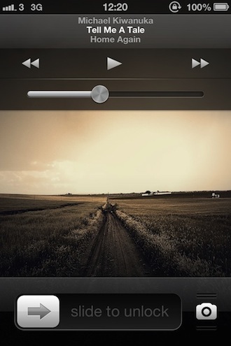
- Oh, the new media controls! We’re reminded of the Music app, aren’t we? Especially the ‘reflective’, metallic volume slider leaves no doubt where it comes from.
- The unlock slider, which has been unchanged since the iPhone came to be.
Is it just me, or is it just too obvious that we indeed are looking at two different design themes here? Here’s the former lock screen with media controls, for comparison. Get it? The play button and the arrow on the unlock slider appear like from the same… ‘family’, if you will. Look at the play button now, its arrow shape has nothing to do with the slider’s, for sure.
The unlock slider belongs to the ‘Classic‘ iOS theme that’s predominant in the Settings app: Pinstripes. Thick, white labels. White, unreflective on/off sliders that become blue upon activation. No transparency, no linen, no metal. 2007.
The media controls, as mentioned, destine from the Music app, and they look like it. Inconsistency, Apple? Really? Don’t get me wrong, I like the design, but frankly: It belongs in the Music app, not as general theme in iOS itself.
There were two design themes in iOS: The ‘old’ one (Settings app etc.), and the later-added linen texture stuff we all love so dearly. When you configure a new iPhone, or an iPhone wakes up after an update, there even are buttons that fit into that scheme, they appear to be more ‘flat’ as you can see in this cnet how-to. Of course, Siri also uses the linen theme and introduces a minimal element of metal.
This duality already isn’t satisfying, especially considering Apple’s focus on design. But now, as I showed above, the Music app’s design pours out of it and introduces a third design theme. This is no good.
Other iOS Problems
Looking at the Settings app and the Notifications section in it, even tech-savvy users begin to cry. I mean, there’s a ‘Do Not Disturb’ label with a slider in the Settings App. Then I tap on ‘Notifications’, and what do I see? A ‘Do Not Disturb’ label with an arrow that leads to a submenu. Are you kidding me? Of course, this is what you risk to end up with when people demand more complexity. But Apple normally doesn’t butcher good menu navigation like this, and for a reason.
The overlay that the new sharing panel is might be somewhere in the middle here. Not terrible, but also clearly not one thing: Well designed. And when new feautures aren’t implemented well, but more crammed in, as it’s the case in both these cases, that just leaves a bad taste in my mouth. A few months back, Martin Weigert already feared for iOS’ well-being and had good points.
Update: This looks buggy.
Jony Ive to the Rescue!
All this makes more obvious that something needs to be done about iOS. Something big, meaning: Full redesign, optics and mechanics.
I hope I misread this and the new media controls are just Jony Ive saying ‘Don’t worry, lads. I’m here.’