Eleven - Redesign
As you may have noticed (since you’re reading this), I have redesigned this blog and my personal page. The Personal Page package by Naz Hamid got an update several months ago, now all responsive. So I implemented it and rebuilt my page over Christmas break.
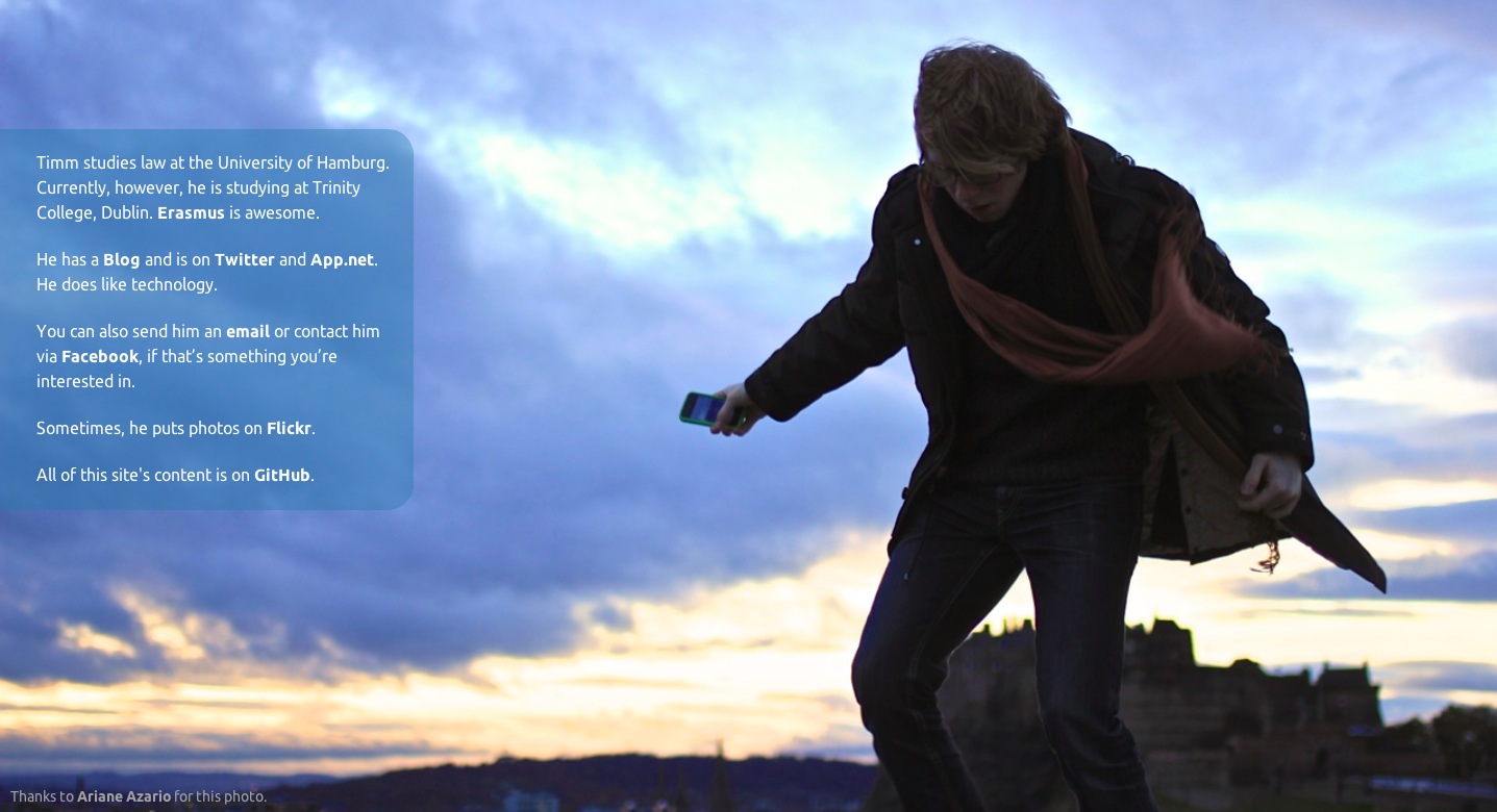
Redesigned Personal Page
When I finally felt comfortable with it and had returned to Dublin, I got punched in the face by a few knackers, so that I spent some time in bed, rocking a minor concussion. I began watching The Sopranos (omg how awesome, I had no idea!) and redesigning my blog.
I am kind of proud that the blog now is completely responsive, including the embedded videos (and pictures, of course), featuring a nice search box and pagination (finally). I got rid of the Disqus comments, since that experiment didn’t go all too well. I also updated the iOS ‘Add to Home Screen’ icon, for those who care. The favicon is the same, but now sports a retina and a regular version in one file. From now on, I’ll post new posts also through a dedicated Twitter account: @tschoof_blog for those of you who retired RSS.
I want to give credit to some resources I used heavily in the redesign process.
Getting Started
I learned about em, media queries and ‘mobile first’ from two tutorials on netmagazine.com: This one got me started, and this multiple parts one got me through most of the steps. That being said, when I googled (um… duckduckgoed?) for specific CSS-related issues, stackoverflow came up and helped a lot. Great resource.
Fluid Video Width
I made videos resize automatically according to window width with this method by Chris Coyier. I don’t use the javascript stuff, but get along with simple TextExpander snippets that put a 16:9, 16:10 or 4:3 wrapper around the YouTube or Vimeo iframes.
Favicon and iOS Icon
I followed John Gruber’s advice regarding the favicon.
For the iOS ‘Add to Home Screen’ icon, I looked up this article that linked to a useful Icon Kit (which is currently unavailable, unfortunately).
Man, Gimp is an abomination.
Pagination
Well, this is pretty simple. I have no idea why I didn’t do this earleir, because pagination is built in to Jekyll. I copy-pasted the code in my index.html, saw what it did, made it fit my idea. If that’s not enough for you, there are plenty pagination-related plugins.
Search
Search is a whole different thing. I realise that a script that indexes the content of every article whose output is then searched by another script is a pretty simple thing programming-wise, but I’m not nearly skilled enough to pull that off. So I was very, very happy when I found Pat Dryburgh’s article on how he had built the custom Duckduckgo search box on Ben Brooks’ page. Beautiful, simple, customisable.
The only thing that bothers me is what seems to be a rendering bug in Safari, since Chrome does a perfect job:

This site's search box, Safari 6.0.2
Since Safari 6.0.4, it displays correctly :)
Future
Now I just need to find a place and layout for the Categories Page.
Feedback
I tested the new sites on a MacBook, an iPhone an iPad mini, and some low-resolution Android smartphone, and am content the results with regard to repsonsiveness and readability. If you, however, have problems with this site or my Personal Page on any device, please contact me (email, twitter, ADN, it’s all on… guess where, on the Personal Page) and I will try to improve the experience.
That being said, I am aware that this site doesn’t look optimal on the iPhone (both pre-5 an 5) in landscape mode, but currently I’m unable to resolve the unsatisfyingly incoherent font sizes, especially the footer text’s.
I think that’s all. Thanks a million to all of those who gave me feedback, and especially Ariane (Attention, c’est une blog francaise! Arthur est un perroquet.) for the photo on the Personal Page.