How an entry-level camera can be better than a flagship
I just switched from an Olympus E-M10, an entry-level micro four thirds camera from 2014 to a Fuji X-H1, a more or less top of the line APS-C model released in early 2018. If you’re interested in what went into my buying decision as a beginner: I posted about it here.
In so many ways, it’s – unsurprisingly – such a joy to use a more professional tool. While the E-M10 was and still is a perfectly fine camera, technology has advanced, and entry-level cameras are just built differently than semi- or full-on professional cameras, and have more advanced features.
But, by switching not only the class of camera but also manufacturers, I noticed there are differences that have nothing to do with the former. Which in this specific case means there are aspects in which the X-H1 is worse than the E-M10.
Exposure Helps
The live histogram is a great feature in most DSLMs, as is another one that’s mostly just called “blinkies”. These highlight/underexposure warnings indicate which areas of the frame might have zero information in them because they’re all dark or blown out. Modern DSLRs mostly have that feature as well, but by the very nature of a DSLR, you’d only see them during your back LCD photo review.
Anyway: The X-H1 has both of those features, but – unsurprisingly now after the above – they’re worse than on the E-M10.
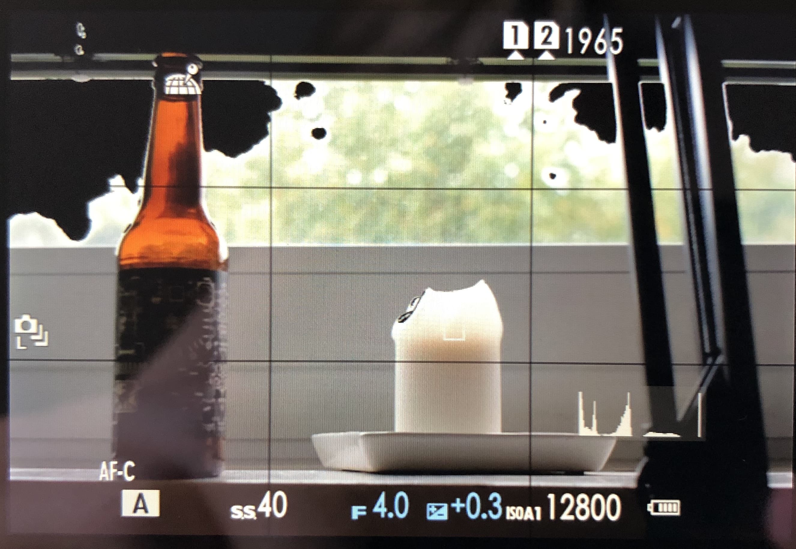
Please excuse the bad photo quality, I didn’t have any means of capturing the EVF/LCD feed via HDMI.
Histogram
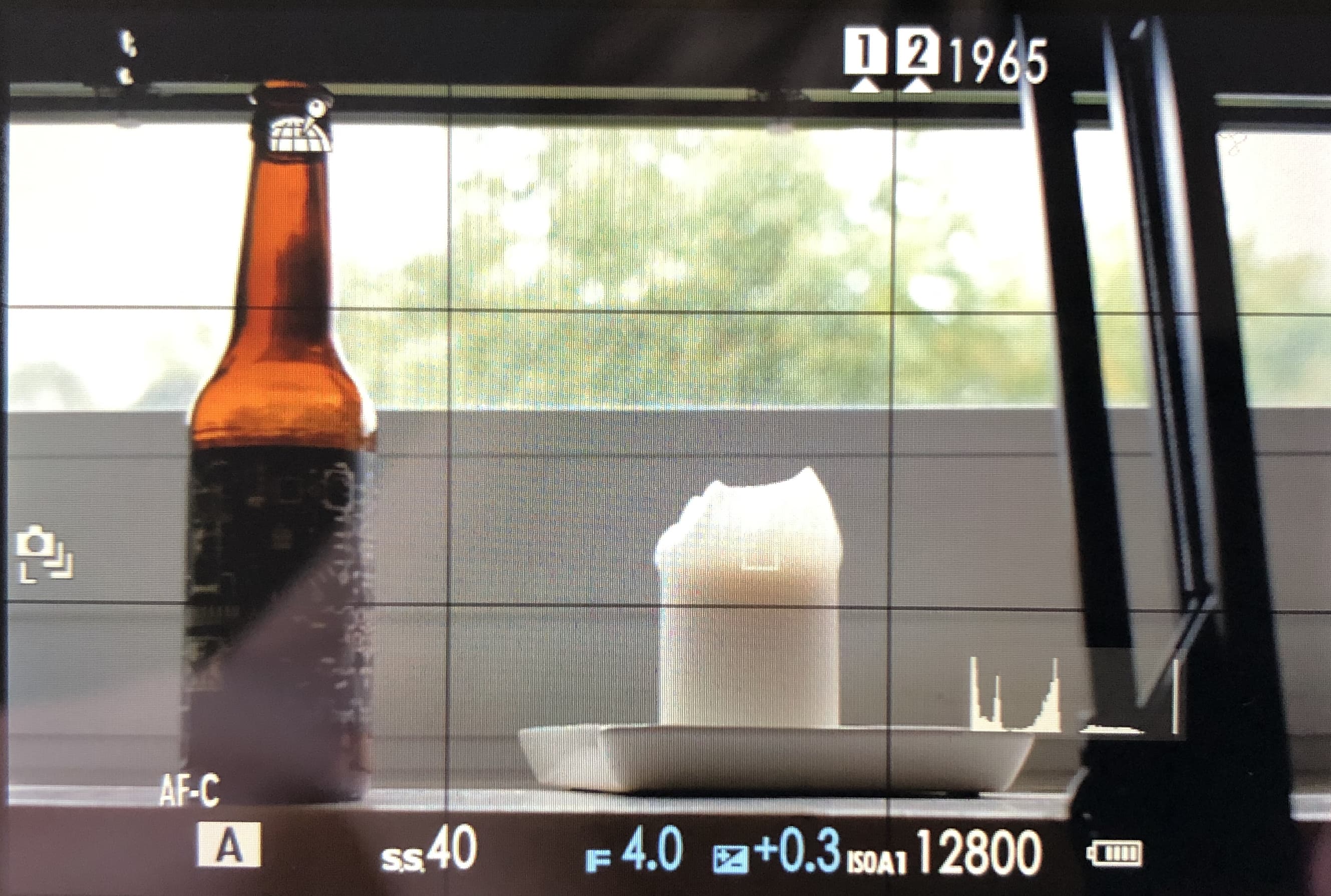
The X-H1's histogram is rather small. Can you find it?
The X-H1’s histogram is rather small. More width really would help with judging how much information is in danger of being blown out. Plus: The image information doesn’t go all the way to the edge of the grey background of the histogram graphic. Speaking of which: The grey background is way too bright, you can’t really tell where it begins and where it ends. It doesn’t just look like that on the photo above. It’s very hard to see if there’s already information lost without changing the exposure back and forth and staring at that tiny white line. It’s a bad experience.
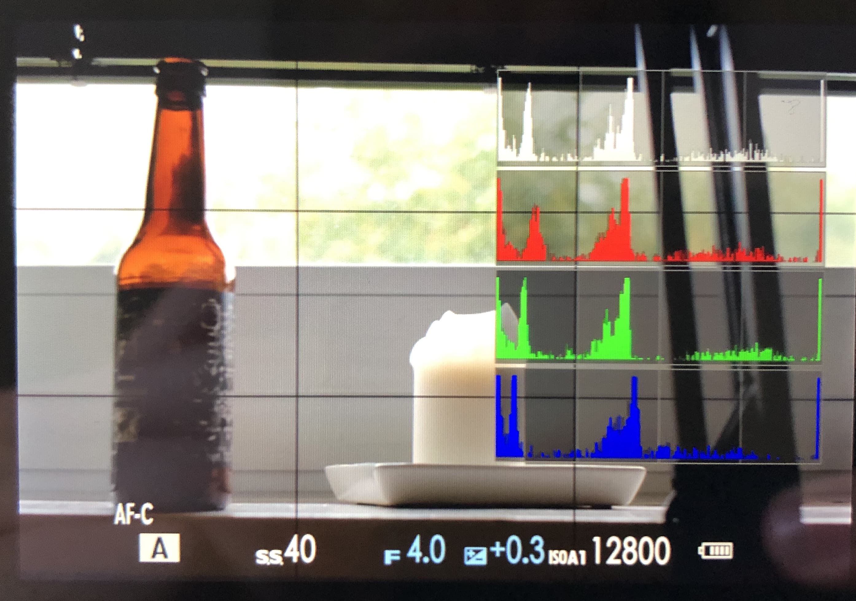
X-H1, I appreciate the effort, but how is this useful?
But: There’s a “big histogram” option that is conveniently invoked by a shortcut. It shows RGB histograms as well as a “regular” one. I appreciate the better legibility. But… RGB? Come on. I know that theoretically the color channels can blow out independently. But I have yet to encounter/think of a situation in which that information would be helpful. If you can explain to me how the RGB histograms make sense, I’d be happy to hear it! Until then, I call bullshit on this feature.
To add injury to insult: The big histograms don’t stay on screen when the exposure is changed.
That’s not only bad, that’s unfuckingusable.
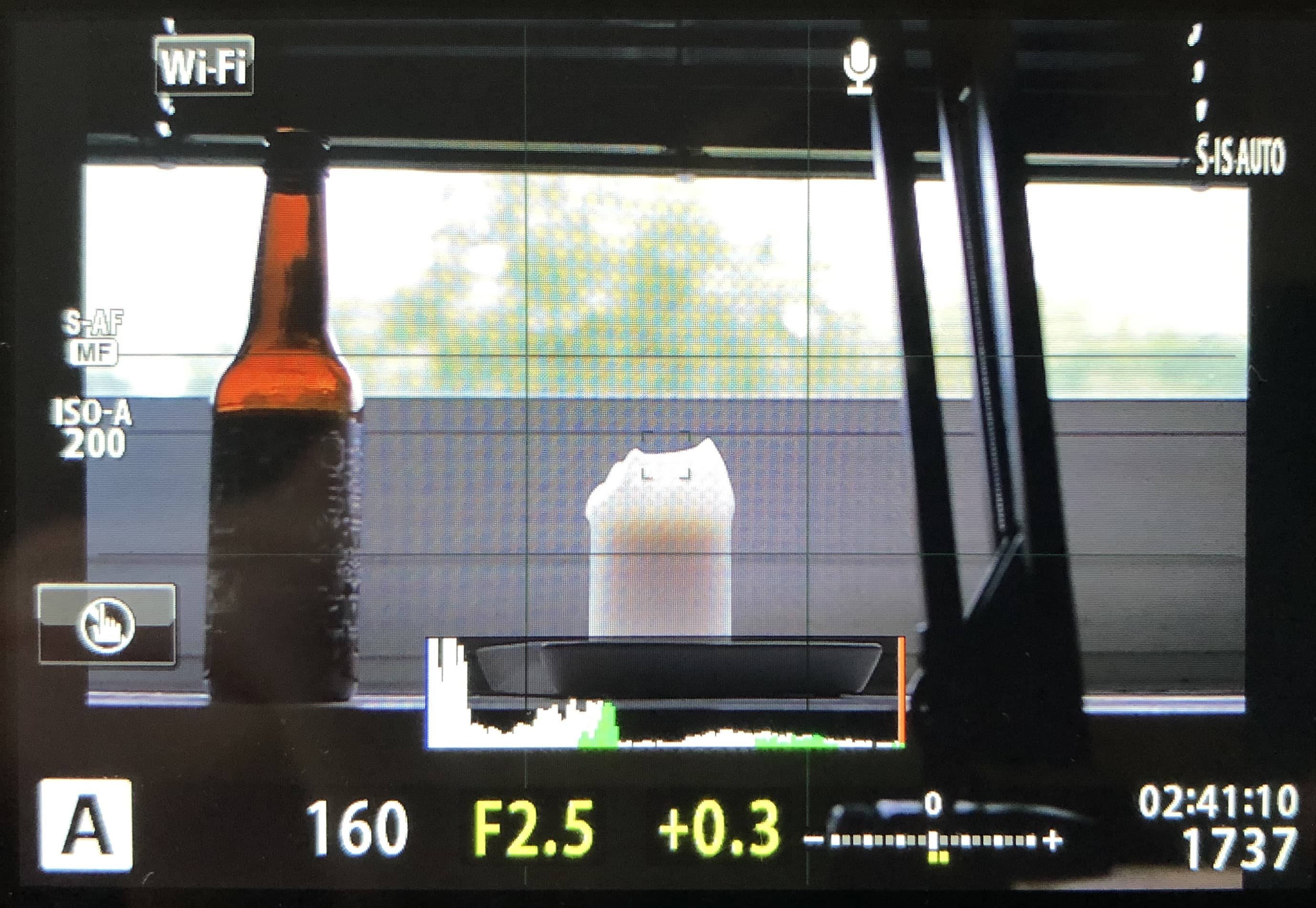
The EM-10's superior histogram
How does the E-M10 do it? The histogram is bigger, the information goes to the edge of the background and once there’s information lost, the outer line turns orange – making it a vastly superior tool for judging the exposure.
Highlight Warning
The highlight warnings on the X-H1 work exactly as they do on a Canon 40D, with the difference of being displayed live on the screen. Right off the bat, that’s bad. Why? Well, only clipped highlights are represented, lost shadow detail isn’t. There’s no conceivable reason for that.
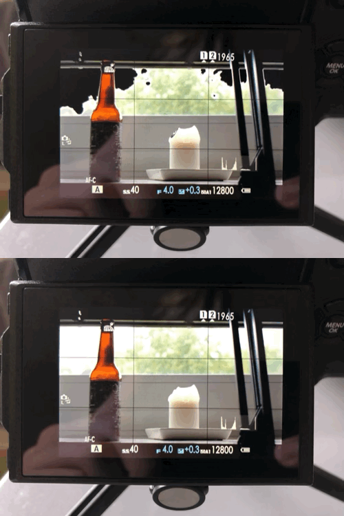
This is really stressful – I must acknowledge, though, that the frequency in this gif is exaggerated for comedic effect
Also: framing a shot through the EVF, thinking about all aspects of the scene is fundamentally different than checking photos on the back LCD. A distracting blinking animation (blown out highlights alternate between black and white every half second) is tolerable during the latter, but it is an absolute nuisance while framing a shot.
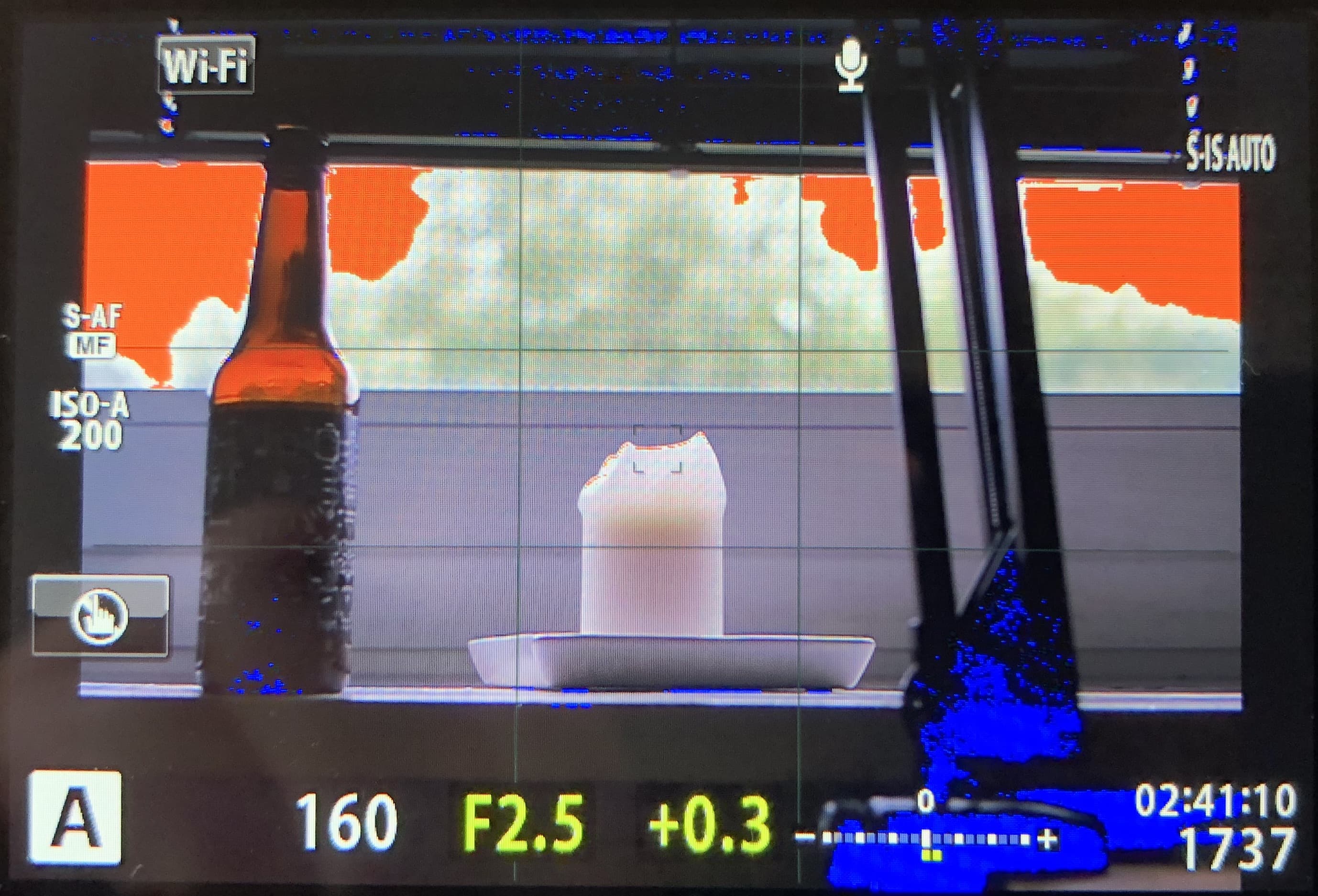
The E-M10's "blinkies" in action
Let’s look at the E-M10: First of all, Olympus considers lost shadow detail worthy of being brought to the photographer’s attention. It is displayed blue, lost highlight detail orange. These colors don’t blink, they are shown continuously. Compared to Fuji’s system, it wins because it doesn’t make me freak out. I don’t know about you, but for me that’s always a win.
I already hear the counter argument, saying that orange is ugly and distracting as well. That’s a fair point, but personally, I find the color-ness of the “blinkies” much less distracting than the constant flashing.
Thinking about this, I also have to think about a manual focus help, focus peaking. For this function, Fuji offers a wide variety of colors in two variants, respectively – albeit no flash on/off variant. I’d appreciate a focus peaking-inspired overhaul of the highlight warning feature.
Auto ISO Display
Changing gears away from the exposure helps: The way the “current” ISO value is displayed while on Auto ISO is handled differently between Olympus and Fuji as well.
The E-M10 always shows the ISO it’d take the exposure with right at that time. The X-H1 needs a half-press of the shutter button (as well as having exposure lock enabled) for that action. Without that configuration, it just shows the maximum ISO of the selected Auto ISO range.
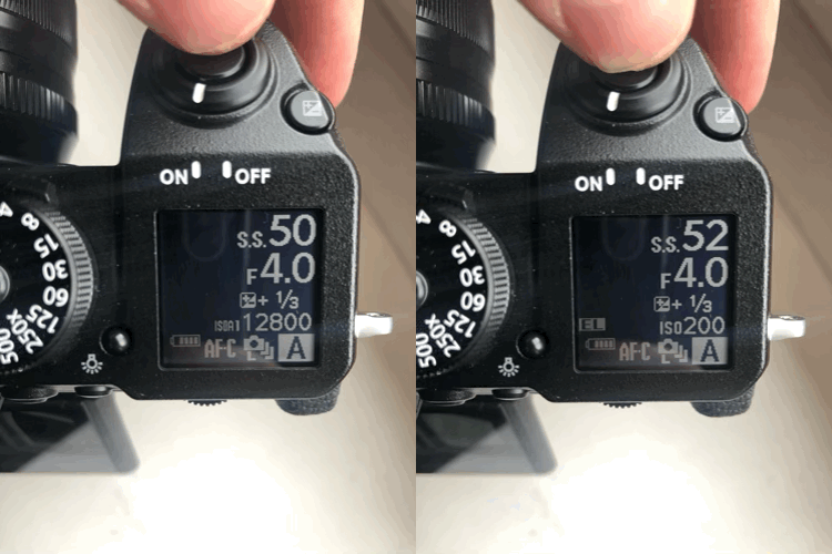
Auto ISO maximum setting 12800, you're great. But I think we should see other people.
I don’t know about you, but most of the time I’d like to know which ballpark I am in ISO-wise, but specifically don’t need to know what the max Auto ISO is. Fuji even shows which of the three distinct Auto ISO ranges you have activated. The extra complexity of getting around that by enabling exposure lock makes it even worse if you’d like the camera to measure exposure for every single frame of a burst.
My guess is that this is tied to how the cameras measure the scene. The behaviour of when the lens opens and closes the aperture for a) just supplying the evf with what it needs and b) focusing is completely different between Olympus and Fuji. The X-H1 stops down all the time, while the E-M10 only closes the aperture for actually taking the photo.
Not gonna lie: The Olympus way feels more modern to me. Hearing the aperture unpredictably open and close is a little bit distracting and feels… unreliable. And I’d also think that an open aperture would just give the camera the most information (light) for everything it needs to do. Except for focusing, where stopping down a bit would come with an advantage in accuracy I’d imagine - as long as there’s enough light. Which seems like something the camera could decide? But Sony cameras also have the lens stop down in normal operation I think, so… there’s that.
In short: I’d really love some insight in what the fundamental difference in design of the whole (sensor/metering?) system is. There are one or two forum threads where people were wondering about this behaviour, but afaik there’s no word from Fuji on that.
